Empty states
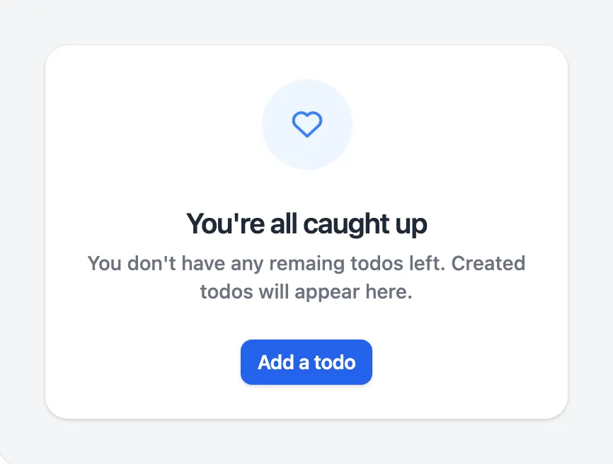
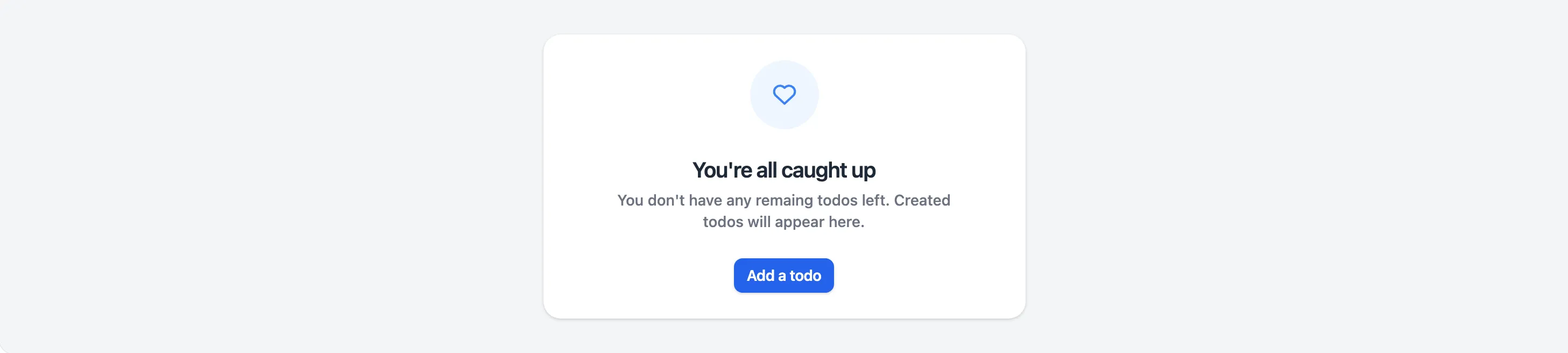
<x-app-ui::empty-state icon="iconic-heart">
    <x-slot name="heading">
        You're all caught up
    </x-slot>

    <x-slot name="description">
        You don't have any remaining todos left. Created todos will appear here.
    </x-slot>

    <x-slot name="actions">
        <x-app-ui::button size="sm">
            Add a todo
        </x-app-ui::button>
    </x-slot>
</x-app-ui::empty-state>
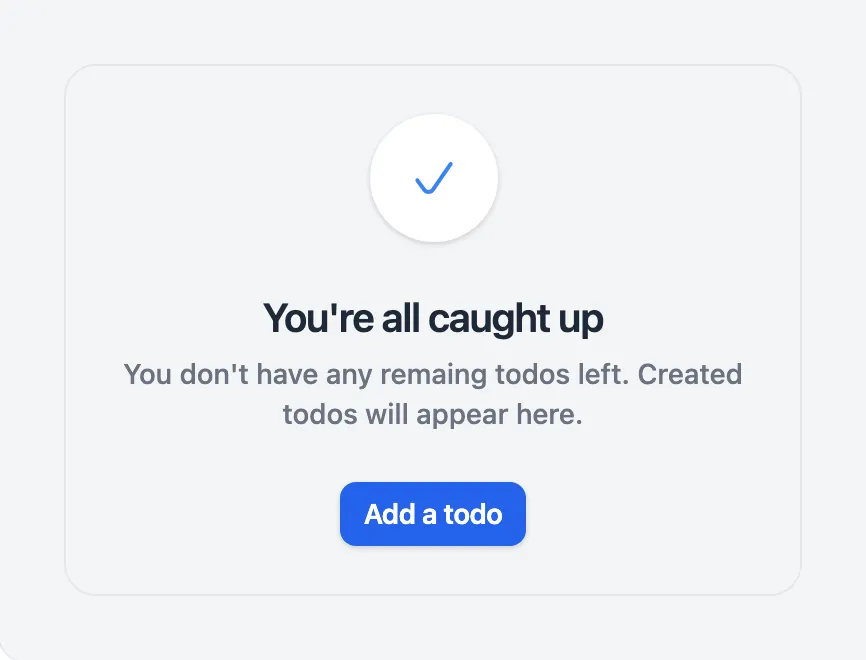
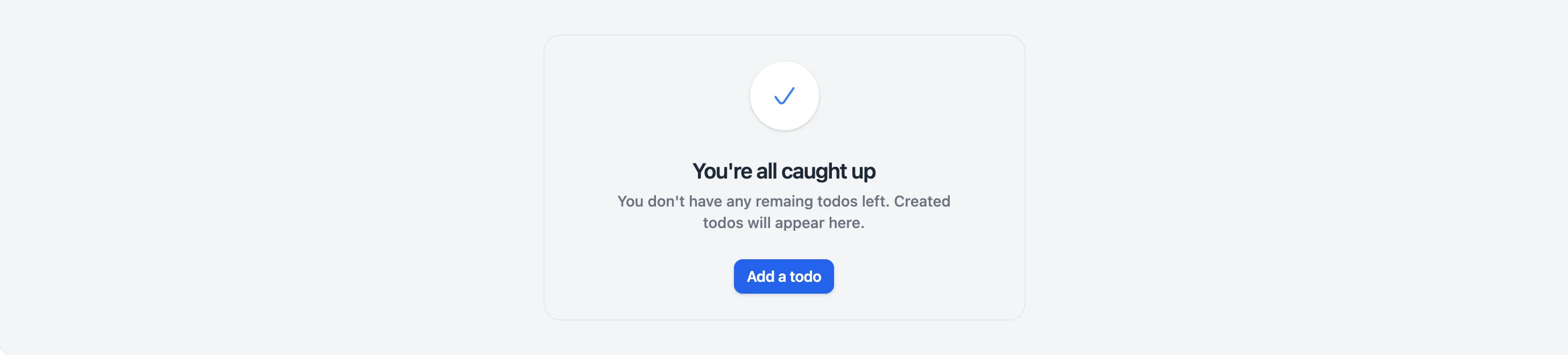
<x-app-ui::empty-state icon="iconic-check" flat>
    <x-slot name="heading">
        You're all caught up
    </x-slot>

    <x-slot name="description">
        You don't have any remaining todos left. Created todos will appear here.
    </x-slot>

    <x-slot name="actions">
        <x-app-ui::button size="sm">
            Add a todo
        </x-app-ui::button>
    </x-slot>
</x-app-ui::empty-state>
API
app-ui::empty-state
Attributes
| Name | Default | Options | Notes |
|---|---|---|---|
flat |
false |
Boolean expression | |
icon |
Any Blade icon component name | ||
width |
xl |
xs, sm, md, lg, xl, 2xl, 3xl, 4xl, 5xl, 6xl, 7xl, full |
Slots
| Name | Notes |
|---|---|
actions |
Contains the app-ui::button components to display in the footer of the card. |
description |
Contains the text content for the description of this empty state. |
heading |
Contains the text content for the heading of this empty state. |