Inputs
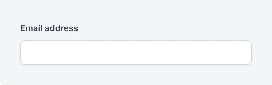

<x-app-ui::input
    label="Email address"
    type="email"
    name="email"
/>
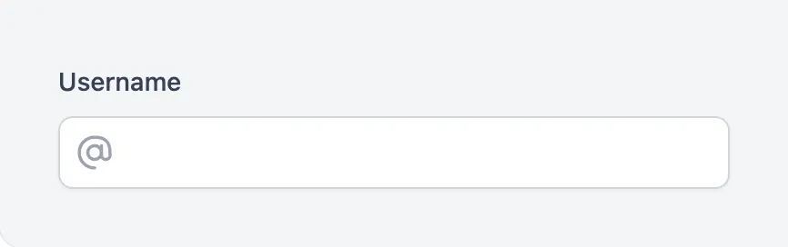
<x-app-ui::input
    label="Username"
    icon="iconic-at-sign"
    name="username"
/>
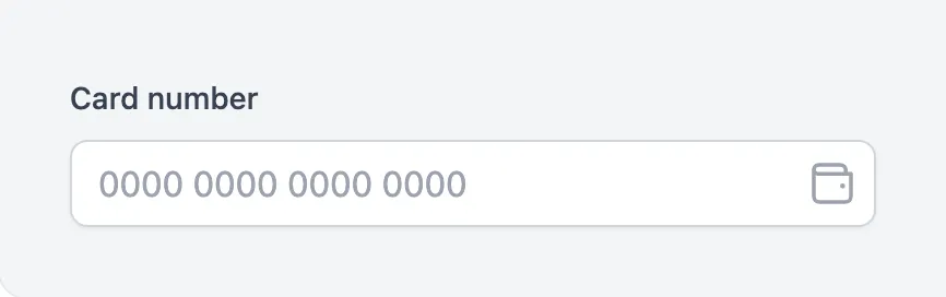
<x-app-ui::input
    label="Card number"
    placeholder="0000 0000 0000 0000"
    icon="iconic-wallet"
    icon-position="after"
    name="card_number"
/>
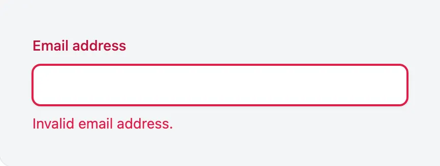

{{-- This component will automatically render errors for the field specified in the `name` attribute. To supply a custom error message, use the `error-text` attribute. --}}

<x-app-ui::input
    label="Email address"
    type="email"
    name="email"
/>
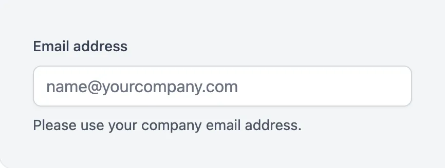

<x-app-ui::input
    label="Email address"
    type="email"
    placeholder="[email protected]"
    helper-text="Please use your company email address."
    name="email"
/>


<x-app-ui::sr-only>
    <label for="search">Search</label>
</x-app-ui::sr-only>

<x-app-ui::input
    type="search"
    icon="iconic-search"
    name="search"
/>
API
app-ui::input
Attributes
| Name | Default | Options | Notes |
|---|---|---|---|
error-text |
|||
helper-text |
|||
icon |
Any Blade icon component name | ||
icon-position |
before |
after, before |
|
id |
name, if provided |
||
label |
|||
name |
If provided, this will be used to display error messages for this field. | ||
placeholder |