Lists

<x-app-ui::list>
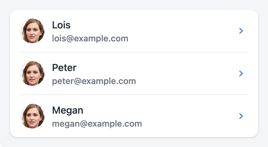
<x-app-ui::list.item>
<x-slot name="start">
<x-app-ui::avatar src="https://thispersondoesnotexist.com/image" />
</x-slot>
<x-app-ui::list.item.detail variant="primary">
Lois
</x-app-ui::list.item.detail>
<x-app-ui::list.item.detail>
[email protected]
</x-app-ui::list.item.detail>
<x-slot name="end">
<x-app-ui::list.item.action
tag="a"
href="#"
label="View"
icon="iconic-chevron-right"
/>
</x-slot>
</x-app-ui::list.item>
<x-app-ui::list.item>
<x-slot name="start">
<x-app-ui::avatar src="https://thispersondoesnotexist.com/image" />
</x-slot>
<x-app-ui::list.item.detail variant="primary">
Peter
</x-app-ui::list.item.detail>
<x-app-ui::list.item.detail>
[email protected]
</x-app-ui::list.item.detail>
<x-slot name="end">
<x-app-ui::list.item.action
tag="a"
href="#"
label="View"
icon="iconic-chevron-right"
/>
</x-slot>
</x-app-ui::list.item>
<x-app-ui::list.item>
<x-slot name="start">
<x-app-ui::avatar src="https://thispersondoesnotexist.com/image" />
</x-slot>
<x-app-ui::list.item.detail variant="primary">
Megan
</x-app-ui::list.item.detail>
<x-app-ui::list.item.detail>
[email protected]
</x-app-ui::list.item.detail>
<x-slot name="end">
<x-app-ui::list.item.action
tag="a"
href="#"
label="View"
icon="iconic-chevron-right"
/>
</x-slot>
</x-app-ui::list.item>
</x-app-ui::list>

<x-app-ui::list>
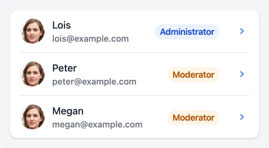
<x-app-ui::list.item>
<x-slot name="start">
<x-app-ui::avatar src="https://thispersondoesnotexist.com/image" />
</x-slot>
<x-app-ui::list.item.columns>
<x-app-ui::list.item.columns.column>
<x-app-ui::list.item.detail variant="primary">
Lois
</x-app-ui::list.item.detail>
<x-app-ui::list.item.detail>
[email protected]
</x-app-ui::list.item.detail>
</x-app-ui::list.item.columns.column>
<x-app-ui::list.item.columns.column align="right">
<x-app-ui::badge color="primary">
Administrator
</x-app-ui::badge>
</x-app-ui::list.item.columns.column>
</x-app-ui::list.item.columns>
<x-slot name="end">
<x-app-ui::list.item.action
tag="a"
href="#"
label="View"
icon="iconic-chevron-right"
/>
</x-slot>
</x-app-ui::list.item>
<x-app-ui::list.item>
<x-slot name="start">
<x-app-ui::avatar src="https://thispersondoesnotexist.com/image" />
</x-slot>
<x-app-ui::list.item.columns>
<x-app-ui::list.item.columns.column>
<x-app-ui::list.item.detail variant="primary">
Peter
</x-app-ui::list.item.detail>
<x-app-ui::list.item.detail>
[email protected]
</x-app-ui::list.item.detail>
</x-app-ui::list.item.columns.column>
<x-app-ui::list.item.columns.column align="right">
<x-app-ui::badge color="warning">
Moderator
</x-app-ui::badge>
</x-app-ui::list.item.columns.column>
</x-app-ui::list.item.columns>
<x-slot name="end">
<x-app-ui::list.item.action
tag="a"
href="#"
label="View"
icon="iconic-chevron-right"
/>
</x-slot>
</x-app-ui::list.item>
<x-app-ui::list.item>
<x-slot name="start">
<x-app-ui::avatar src="https://thispersondoesnotexist.com/image" />
</x-slot>
<x-app-ui::list.item.columns>
<x-app-ui::list.item.columns.column>
<x-app-ui::list.item.detail variant="primary">
Megan
</x-app-ui::list.item.detail>
<x-app-ui::list.item.detail>
[email protected]
</x-app-ui::list.item.detail>
</x-app-ui::list.item.columns.column>
<x-app-ui::list.item.columns.column align="right">
<x-app-ui::badge color="warning">
Moderator
</x-app-ui::badge>
</x-app-ui::list.item.columns.column>
</x-app-ui::list.item.columns>
<x-slot name="end">
<x-app-ui::list.item.action
tag="a"
href="#"
label="View"
icon="iconic-chevron-right"
/>
</x-slot>
</x-app-ui::list.item>
</x-app-ui::list>
<x-app-ui::list>
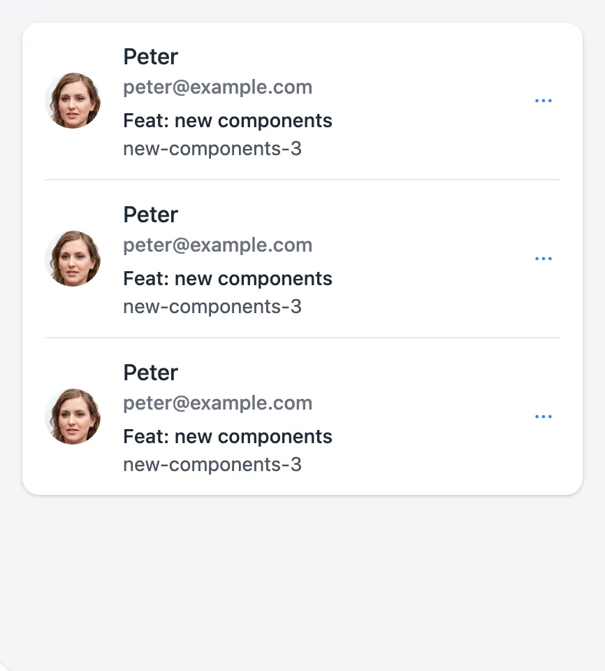
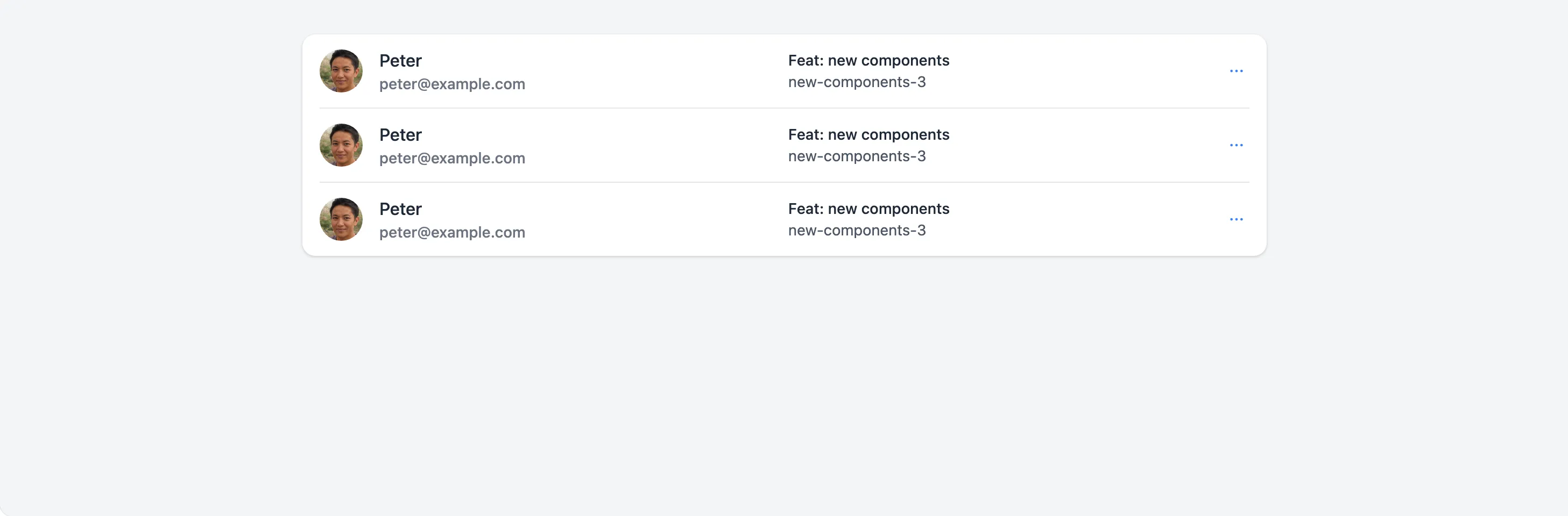
<x-app-ui::list.item>
<x-app-ui::list.item.columns>
<x-app-ui::list.item.columns.column>
<x-app-ui::list.item.detail variant="primary">
Peter
</x-app-ui::list.item.detail>
<x-app-ui::list.item.detail variant="primary">
[email protected]
</x-app-ui::list.item.detail>
</x-app-ui::list.item.columns.column>
<x-app-ui::list.item.columns.column>
<x-app-ui::list.item.detail variant="secondary">
Feat: new components
</x-app-ui::list.item.detail>
<x-app-ui::list.item.detail>
new-components-3
</x-app-ui::list.item.detail>
</x-app-ui::list.item.columns.column>
</x-app-ui::list.item.columns>
<x-slot name="end">
<x-app-ui::dropdown position="bottom-right">
<x-slot name="trigger">
<x-app-ui::list.item.action
x-on:click="open = true"
label="More options"
icon="iconic-dots-horizontal"
/>
</x-slot>
<x-app-ui::dropdown.item>
Favorite
</x-app-ui::dropdown.item>
<x-app-ui::dropdown.item>
Share
</x-app-ui::dropdown.item>
<x-app-ui::dropdown.item>
Report
</x-app-ui::dropdown.item>
</x-app-ui::dropdown>
</x-slot>
</x-app-ui::list.item>
</x-app-ui::list>
API
app-ui::list
Slots
| Name | Notes |
|---|---|
| Main | Contains the app-ui::list.item components to display in the list. |
actions |
Contains the app-ui::button components to display below the list items. |
heading |
Contains the text content for the list heading. |
subheading |
Contains the text content for the list subheading. |
app-ui::list.item
Attributes
| Name | Default | Options | Notes |
|---|---|---|---|
tag |
div |
a, button, div |
Defines the underlying HTML tag used, and thus the list item's capabilities. For example, only a list item may use the href attribute. |
Slots
| Name | Notes |
|---|---|
| Main | Contains the elements to display in the main part of the list item. |
end |
Contains the component to display at the end of the list item, often app-ui::avatar or app-ui::icon-button. |
start |
Contains the component to display at the start of the list item, often app-ui::avatar or app-ui::icon-button. |
app-ui::list.item.action
Attributes
| Name | Default | Options | Notes |
|---|---|---|---|
icon |
Any Blade icon component name | ||
label |
Used for accessibility. | ||
tag |
button |
a, button |
Defines the underlying HTML tag used, and thus the button's capabilities. For example, only a buttons may use the href attribute. |
app-ui::list.item.columns
Slots
| Name | Notes |
|---|---|
| Main | Contains the app-ui::list.item.columns.column components, which is displays horizontally on desktop and vertically on mobile. |
app-ui::list.item.columns.column
Attributes
| Name | Default | Options | Notes |
|---|---|---|---|
align |
left |
left, center, right |
Slots
| Name | Notes |
|---|---|
| Main | Contains the contents of this column. |
app-ui::list.item.detail
Attributes
| Name | Default | Options | Notes |
|---|---|---|---|
icon |
Any Blade icon component name | ||
variant |
primary, secondary |
Primary details are darker and larger than default. Secondary details are just darker. |
Slots
| Name | Notes |
|---|---|
| Main | Contains the text content for this detail. |