Steps
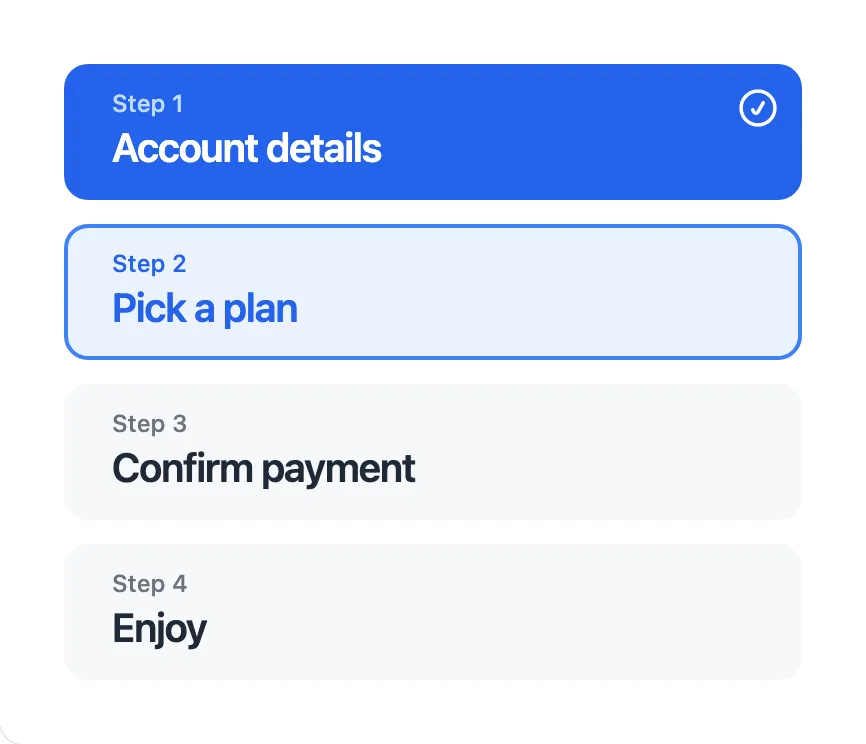

<x-app-ui::steps>
    <x-app-ui::steps.item
        completed
        completed-icon="iconic-check-circle"
    >
        <x-slot name="label">
            Step 1
        </x-slot>

        Account details
    </x-app-ui::steps.item>

    <x-app-ui::steps.item active>
        <x-slot name="label">
            Step 2
        </x-slot>

        Pick a plan
    </x-app-ui::steps.item>

    <x-app-ui::steps.item>
        <x-slot name="label">
            Step 3
        </x-slot>

        Confirm payment
    </x-app-ui::steps.item>

    <x-app-ui::steps.item>
        <x-slot name="label">
            Step 4
        </x-slot>

        Enjoy
    </x-app-ui::steps.item>
</x-app-ui::steps>
API
app-ui::steps
Attributes
| Name | Default | Options | Notes |
|---|---|---|---|
count |
4 |
1 to 8 |
Indicates the number of app-ui::steps.item components in the main slot. |
Slots
| Name | Notes |
|---|---|
| Main | Contains the child app-ui::steps.item components to display. |
app-ui::steps.item
Attributes
| Name | Default | Options | Notes |
|---|---|---|---|
active |
false |
Boolean expression | |
completed |
false |
Boolean expression | |
completed-icon |
Any Blade icon component names | ||
tag |
button |
a, button |
Defines the underlying HTML tag used, and thus the button's capabilities. For example, only a buttons may use the href attribute. |
Slots
| Name | Notes |
|---|---|
| Main | Contains the text content for the steps item. |
label |
Contains the text content for the step item label. |