Navbars
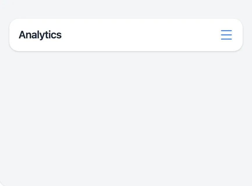
<x-app-ui::navbar>
<x-slot name="start">
<x-app-ui::navbar.brand href="#">
Analytics
</x-app-ui::navbar.brand>
</x-slot>
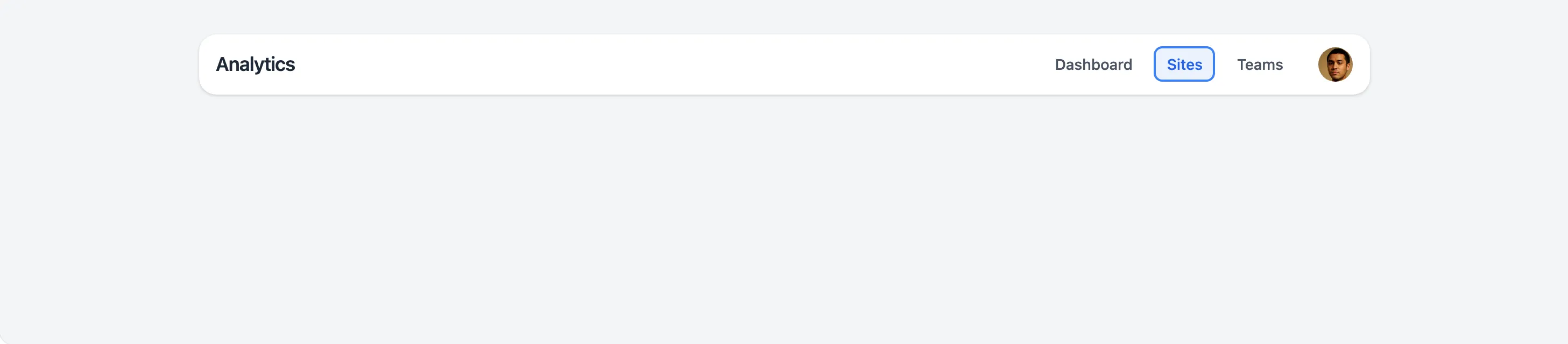
<x-slot name="desktopMenu">
<x-app-ui::navbar.desktop.item href="#">
Dashboard
</x-app-ui::navbar.desktop.item>
<x-app-ui::navbar.desktop.item href="#" active>
Sites
</x-app-ui::navbar.desktop.item>
<x-app-ui::navbar.desktop.item href="#">
Teams
</x-app-ui::navbar.desktop.item>
<x-app-ui::navbar.desktop.avatar href="#">
<x-app-ui::avatar src="https://thispersondoesnotexist.com/image" size="sm" />
</x-app-ui::navbar.desktop.avatar>
</x-slot>
<x-slot name="mobileMenu">
<x-app-ui::navbar.mobile.item href="#">
Dashboard
</x-app-ui::navbar.mobile.item>
<x-app-ui::navbar.mobile.item href="#" active>
Sites
</x-app-ui::navbar.mobile.item>
<x-app-ui::navbar.mobile.item href="#">
Teams
</x-app-ui::navbar.mobile.item>
</x-slot>
</x-app-ui::navbar>
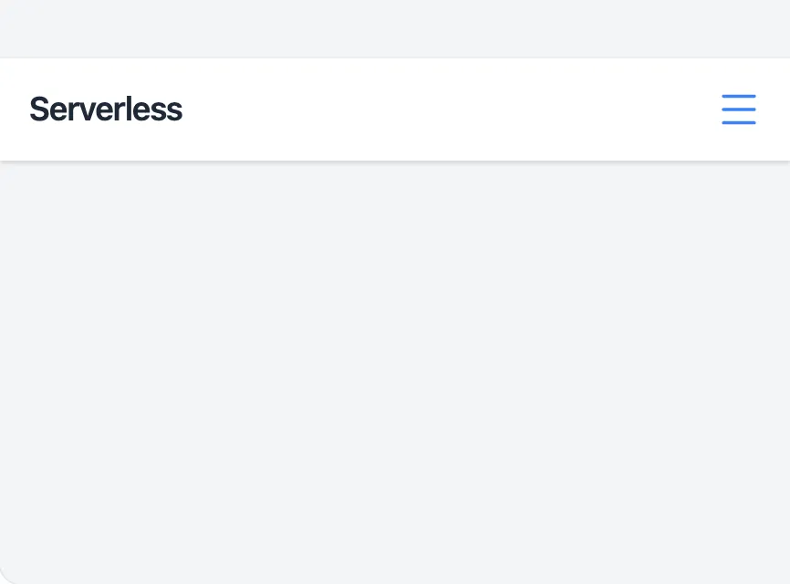
<x-app-ui::navbar full-width>
<x-slot name="start">
<x-app-ui::navbar.brand href="#">
Analytics
</x-app-ui::navbar.brand>
</x-slot>
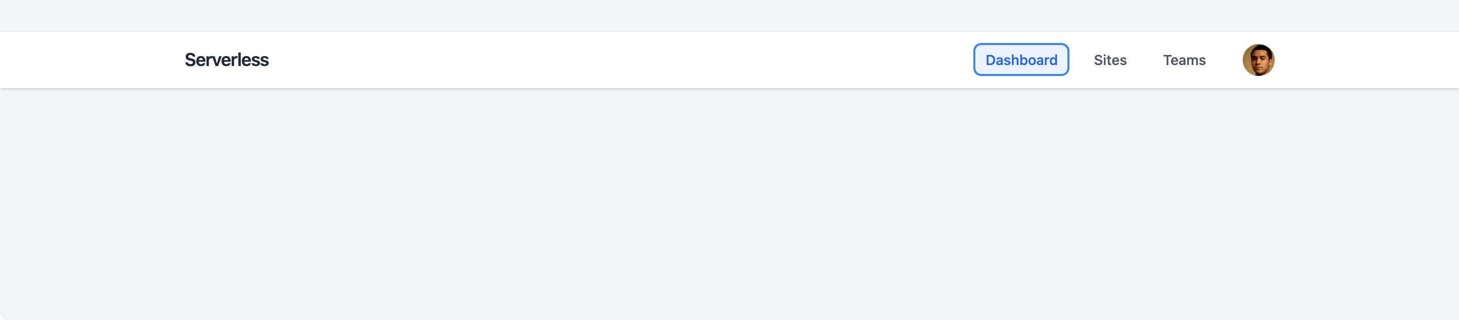
<x-slot name="desktopMenu">
<x-app-ui::navbar.desktop.item href="#" active>
Dashboard
</x-app-ui::navbar.desktop.item>
<x-app-ui::navbar.desktop.item href="#">
Sites
</x-app-ui::navbar.desktop.item>
<x-app-ui::navbar.desktop.item href="#">
Teams
</x-app-ui::navbar.desktop.item>
<x-app-ui::navbar.desktop.avatar href="#">
<x-app-ui::avatar src="https://thispersondoesnotexist.com/image" size="sm" />
</x-app-ui::navbar.desktop.avatar>
</x-slot>
<x-slot name="mobileMenu">
<x-app-ui::navbar.mobile.item href="#" active>
Dashboard
</x-app-ui::navbar.mobile.item>
<x-app-ui::navbar.mobile.item href="#">
Sites
</x-app-ui::navbar.mobile.item>
<x-app-ui::navbar.mobile.item href="#">
Teams
</x-app-ui::navbar.mobile.item>
</x-slot>
</x-app-ui::navbar>
API
app-ui::navbar
Attributes
| Name | Default | Options | Notes |
|---|---|---|---|
full-width |
false |
Boolean expression | Defines if the navbar container spans the full width of the page, or if is contained to the width of the page content. |
mobile-menu-icon |
Any Blade icon component name | Define a custom icon to toggle the mobile menu. | |
mobile-menu-id |
mobile-menu |
Define a custom ID for the mobile menu container. This is used for accessibility features. |
Slots
| Name | Notes |
|---|---|
desktop-menu |
Contains the right-aligned menu items for desktop users. |
mobile-menu |
Contains the menu items for mobile users. |
start |
Contains the left-aligned content of the navbar, commonly used to display the app's brand name. |
app-ui::navbar.brand
Slots
| Name | Notes |
|---|---|
| Main | Contains the text content for the brand name. |
app-ui::desktop.avatar
Attributes
| Name | Default | Options | Notes |
|---|---|---|---|
tag |
button |
a, button |
Defines the underlying HTML tag used for the button container, and thus its capabilities. For example, only a avatars may use the href attribute. |
Slots
| Name | Notes |
|---|---|
| Main | Contains the app-ui::avatar component to display. |
app-ui::desktop.item
Attributes
| Name | Default | Options | Notes |
|---|---|---|---|
active |
false | Boolean expression |
Slots
| Name | Notes |
|---|---|
| Main | Contains the text content for the menu item. |
app-ui::mobile.item
Attributes
| Name | Default | Options | Notes |
|---|---|---|---|
active |
false | Boolean expression |
Slots
| Name | Notes |
|---|---|
| Main | Contains the text content for the menu item. |