Tabs
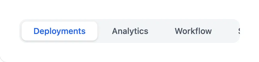

<x-app-ui::tabs>
    <x-app-ui::tabs.item active>
        Deployments
    </x-app-ui::tabs.item>

    <x-app-ui::tabs.item>
        Analytics
    </x-app-ui::tabs.item>

    <x-app-ui::tabs.item>
        Workflow
    </x-app-ui::tabs.item>

    <x-app-ui::tabs.item>
        Settings
    </x-app-ui::tabs.item>
</x-app-ui::tabs>
API
app-ui::tabs
Slots
| Name | Notes |
|---|---|
| Main | Contains the individual app-ui::tabs.item components. |
app-ui::tabs.item
Attributes
| Name | Default | Options | Notes |
|---|---|---|---|
active |
false | Boolean expression | |
tag |
button |
a, button |
Defines the underlying HTML tag used, and thus the button's capabilities. For example, only a buttons may use the href attribute. |
Slots
| Name | Notes |
|---|---|
| Main | Contains the text content of the button. |