Popovers
<x-app-ui::popover id="deploy">
<x-slot name="trigger">
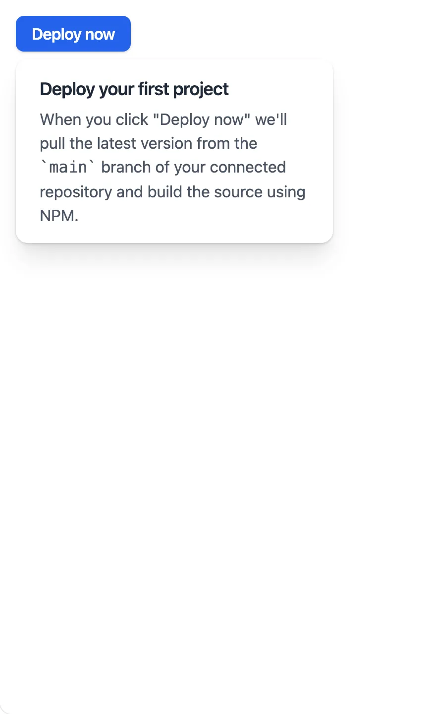
<x-app-ui::button x-on:click="open = ! open">
Deploy now
</x-app-ui::button>
</x-slot>
<x-slot name="heading">
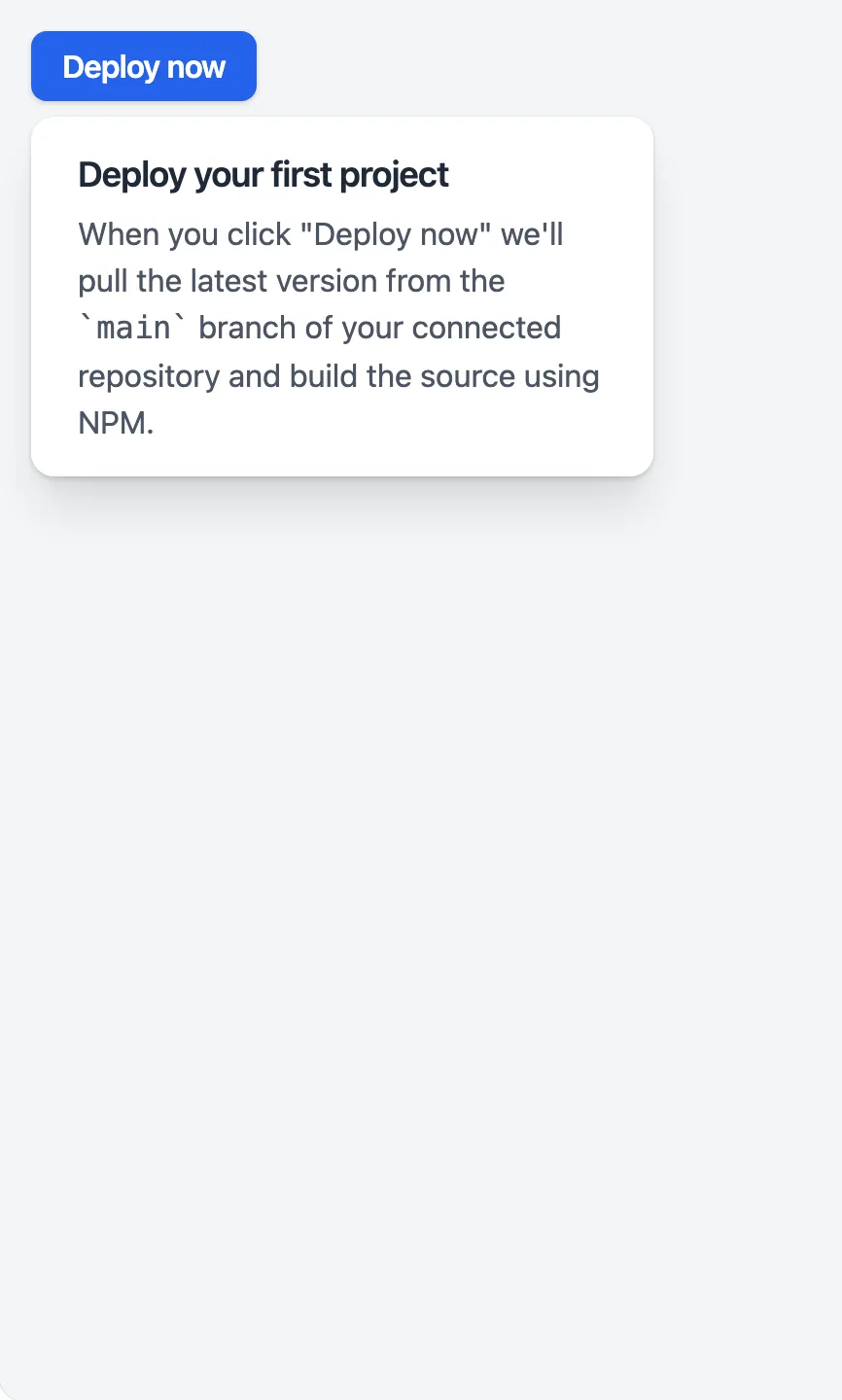
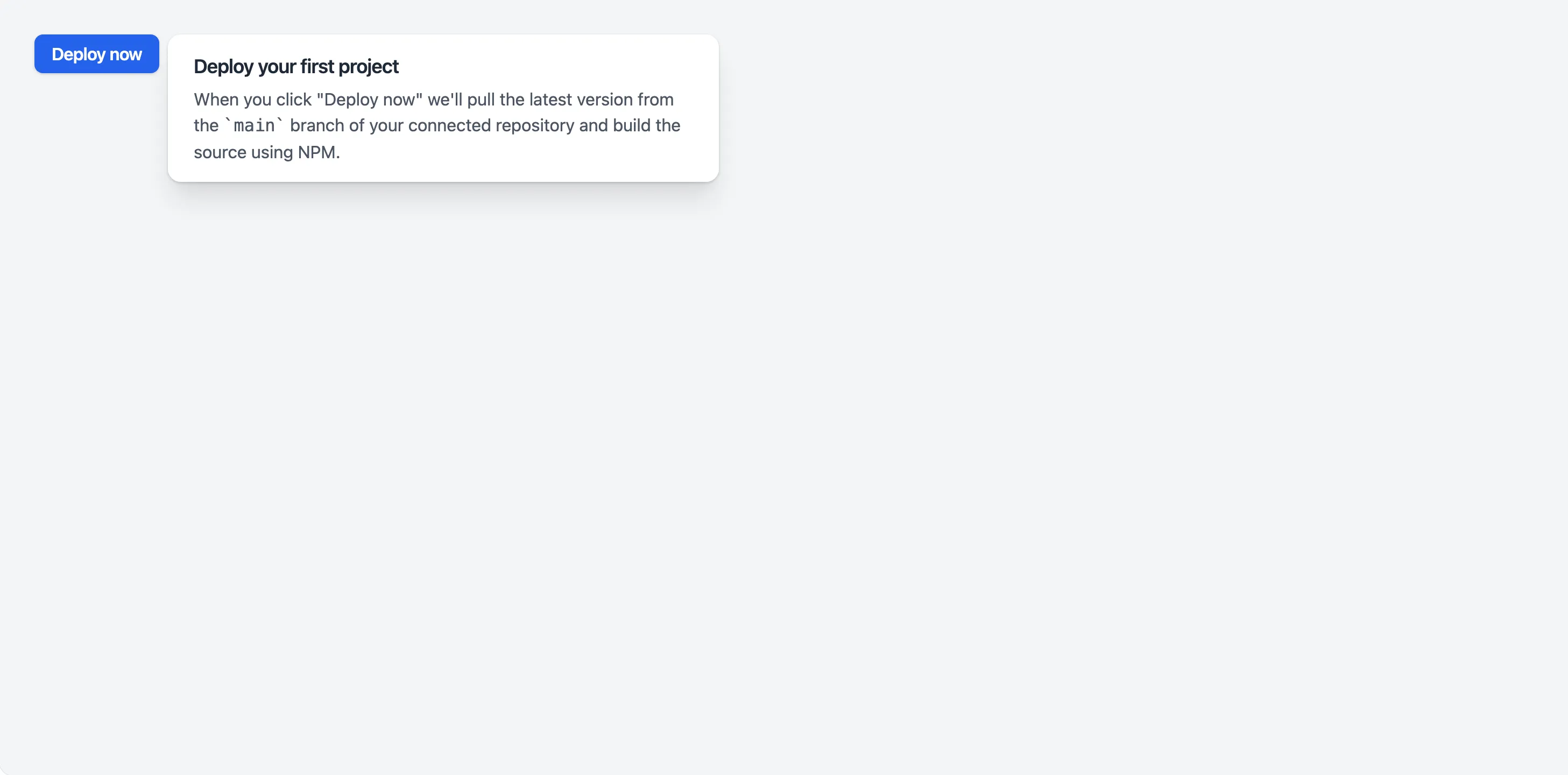
Deploy your first project
</x-slot>
<x-slot name="content">
When you click "Deploy now" we'll pull the latest version from the <code>main</code> branch of your connected repository and build the source using NPM.
</x-slot>
</x-app-ui::popover>
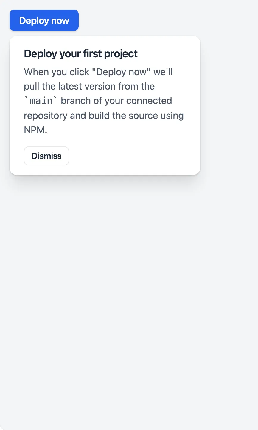
<x-app-ui::popover id="deploy">
    <x-slot name="trigger">
        <x-app-ui::button x-on:click="open = ! open">
            Deploy now
        </x-app-ui::button>
    </x-slot>

    <x-slot name="heading">
        Deploy your first project
    </x-slot>

    <x-slot name="content">
        When you click "Deploy now" we'll pull the latest version from the <code>main</code> branch of your connected repository and build the source using NPM.
    </x-slot>

    <x-slot name="actions">
        <x-app-ui::popover.actions>
            <x-app-ui::button x-on:click="open = false" color="secondary" size="sm">Dismiss</x-app-ui::button>
        </x-app-ui::popover.actions>
    </x-slot>
</x-app-ui::popover>
<x-app-ui::popover id="deploy">
<x-slot name="trigger">
<x-app-ui::button x-on:click="open = ! open">
Deploy now
</x-app-ui::button>
</x-slot>
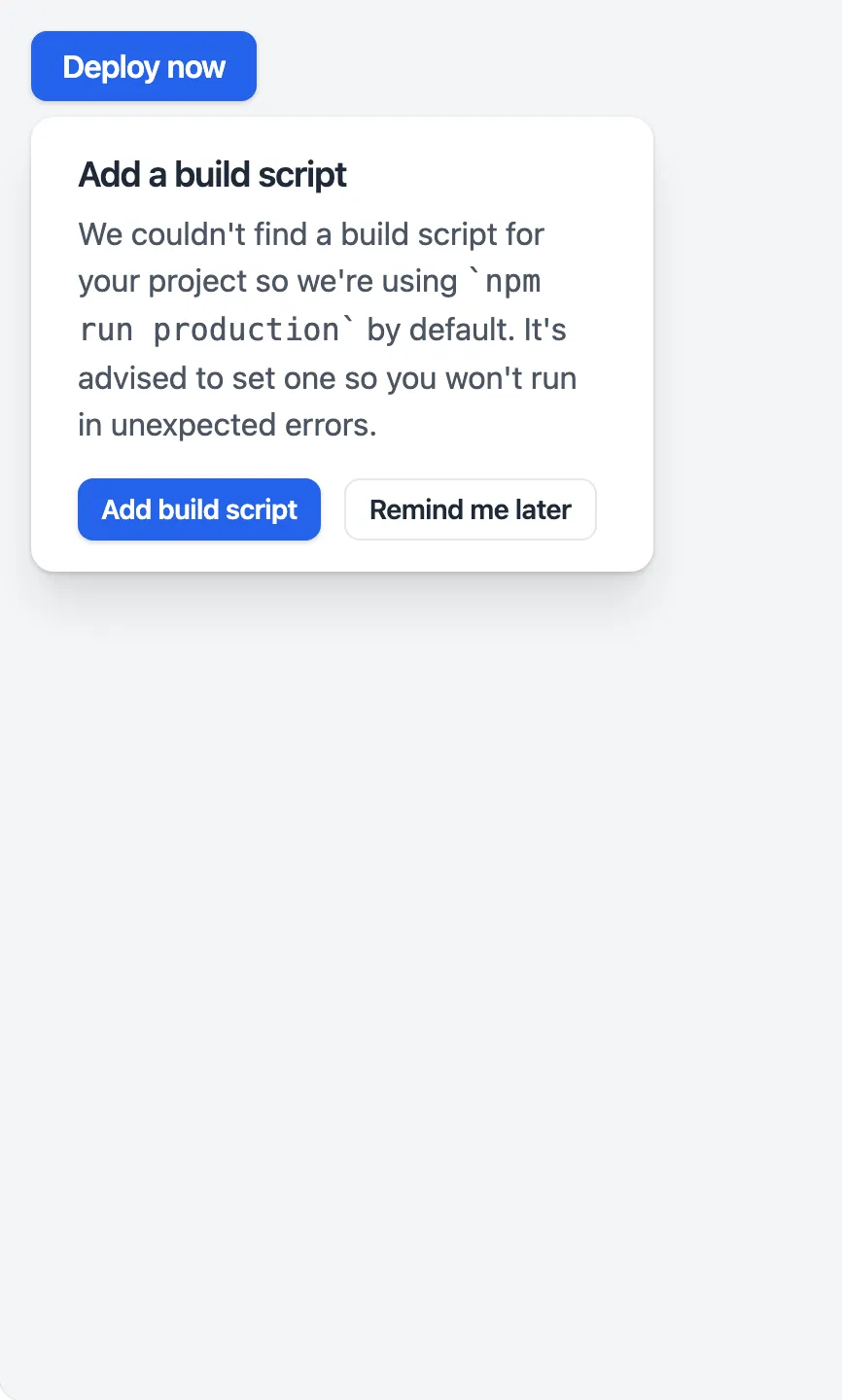
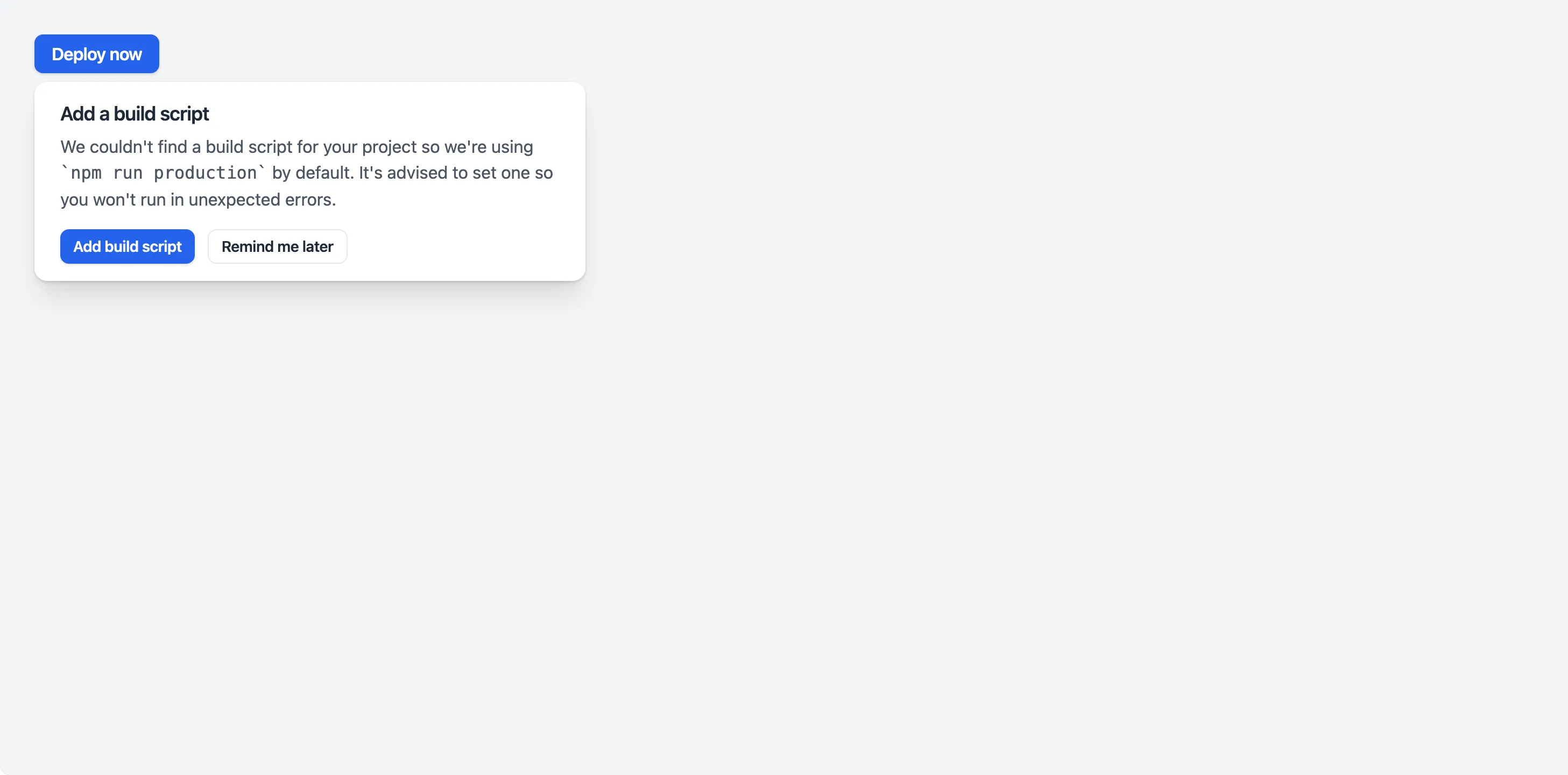
<x-slot name="heading">
Add a build script
</x-slot>
<x-slot name="content">
We couldn't find a build script for your project so we're using <code>npm run production</code> by default. It's advised to set one so you won't run in unexpected errors.
</x-slot>
<x-slot name="actions">
<x-app-ui::popover.actions>
<x-app-ui::button size="sm">Add build script</x-app-ui::button>
<x-app-ui::button x-on:click="open = false" color="secondary" size="sm">Remind me later</x-app-ui::button>
</x-app-ui::popover.actions>
</x-slot>
</x-app-ui::popover>
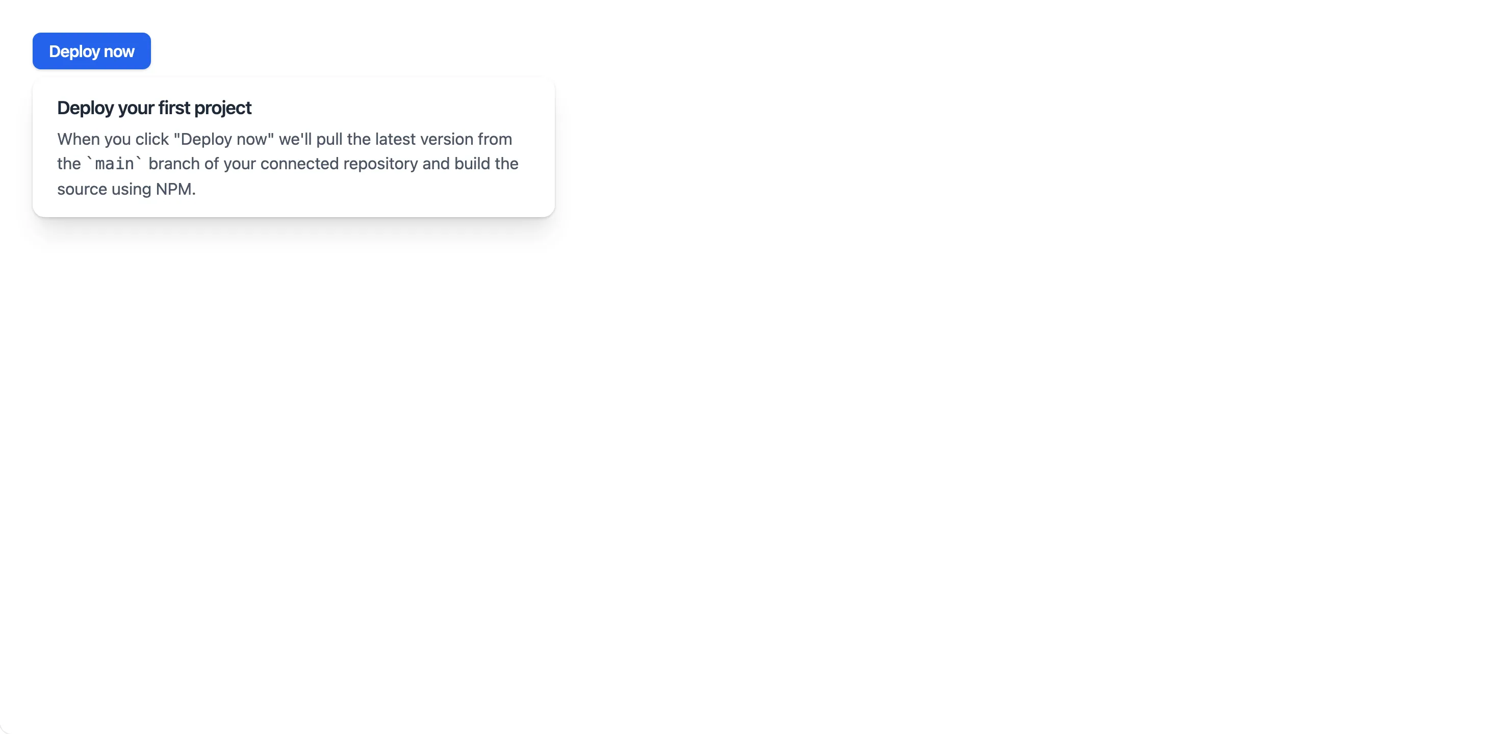
<x-app-ui::popover position="right" id="deploy">
    <x-slot name="trigger">
        <x-app-ui::button x-on:click="open = ! open">
            Deploy now
        </x-app-ui::button>
    </x-slot>

    <x-slot name="heading">
        Deploy your first project
    </x-slot>

    <x-slot name="content">
        When you click "Deploy now" we'll pull the latest version from the <code>main</code> branch of your connected repository and build the source using NPM.
    </x-slot>
</x-app-ui::popover>
API
app-ui::popover
Attributes
| Name | Default | Options | Notes |
|---|---|---|---|
close-event-name |
close-popover |
Used as the name of the browser event to close the popover. | |
display-classes |
inline-block |
Used to alter the display mode of the trigger. | |
id |
Used for triggering popover state using browser events, and accessibility features. | ||
open-event-name |
open-popover |
Used as the name of the browser event to open the popover. | |
position |
below |
below, right |
|
width |
lg |
xs, sm, md, lg, xl, 2xl, 3xl, 4xl, 5xl, 6xl, 7xl, full |
Browser events
| Name | Parameters | Description | Notes |
|---|---|---|---|
close-popover |
id of popover |
Close the popover. | Event name can be customised using the close-event-name attribute. |
open-popover |
id of popover |
Open the popover. | Event name can be customised using the open-event-name attribute. |
Slots
| Name | Notes |
|---|---|
| Main | Contains the content of the popover, between its header and footer. |
actions |
Contains an app-ui.popover.actions component to display below the content of the card. |
content |
Contains text content for the popover. |
heading |
Contains heading text for the popover. |
trigger |
Contains the element to trigger the popover open. This element should use the attribute x-on:click="open = true" |
app-ui::popover.actions
Attributes
| Name | Default | Options | Notes |
|---|---|---|---|
align |
left |
left, center, right |
|
full-width |
false |
Boolean expression | This stretches the child buttons to occupy the full container width. |
Slots
| Name | Notes |
|---|---|
| Main | Contains the individual app-ui::button components. |
app-ui::popover.heading
Slots
| Name | Notes |
|---|---|
| Main | Contains the text content of the heading. |
app-ui::popover.subheading
| Name | Notes |
|---|---|
| Main | Contains the text content of the subheading. |