Modals

<x-app-ui::modal id="confirm-delete">
<x-slot name="trigger">
<x-app-ui::button x-on:click="open = true">
Open confirm delete
</x-app-ui::button>
</x-slot>
<x-slot name="heading">
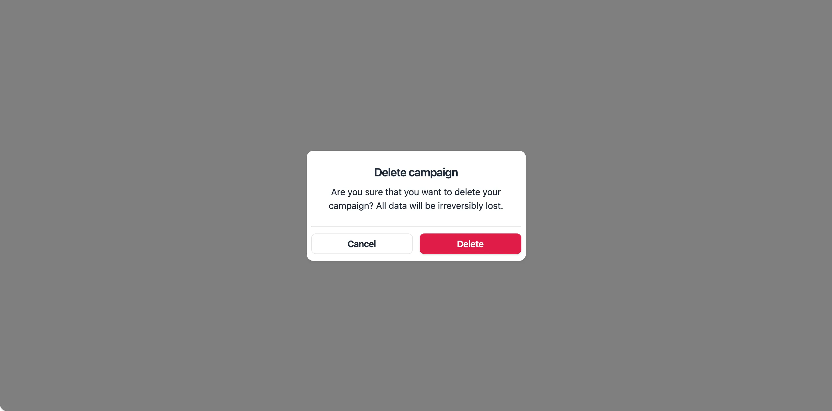
Delete campaign
</x-slot>
<x-slot name="subheading">
Are you sure that you want to delete your campaign? All data will be irreversibly lost.
</x-slot>
<x-slot name="footer">
<x-app-ui::modal.actions full-width>
<x-app-ui::button x-on:click="open = false" color="secondary">
Cancel
</x-app-ui::button>
<x-app-ui::button color="danger">
Delete
</x-app-ui::button>
</x-app-ui::modal.actions>
</x-slot>
</x-app-ui::modal>
<x-app-ui::modal width="lg" id="confirm-delete">
<x-slot name="trigger">
<x-app-ui::button x-on:click="open = true">
Open confirm delete with input
</x-app-ui::button>
</x-slot>
<x-slot name="header">
<x-app-ui::modal.heading>
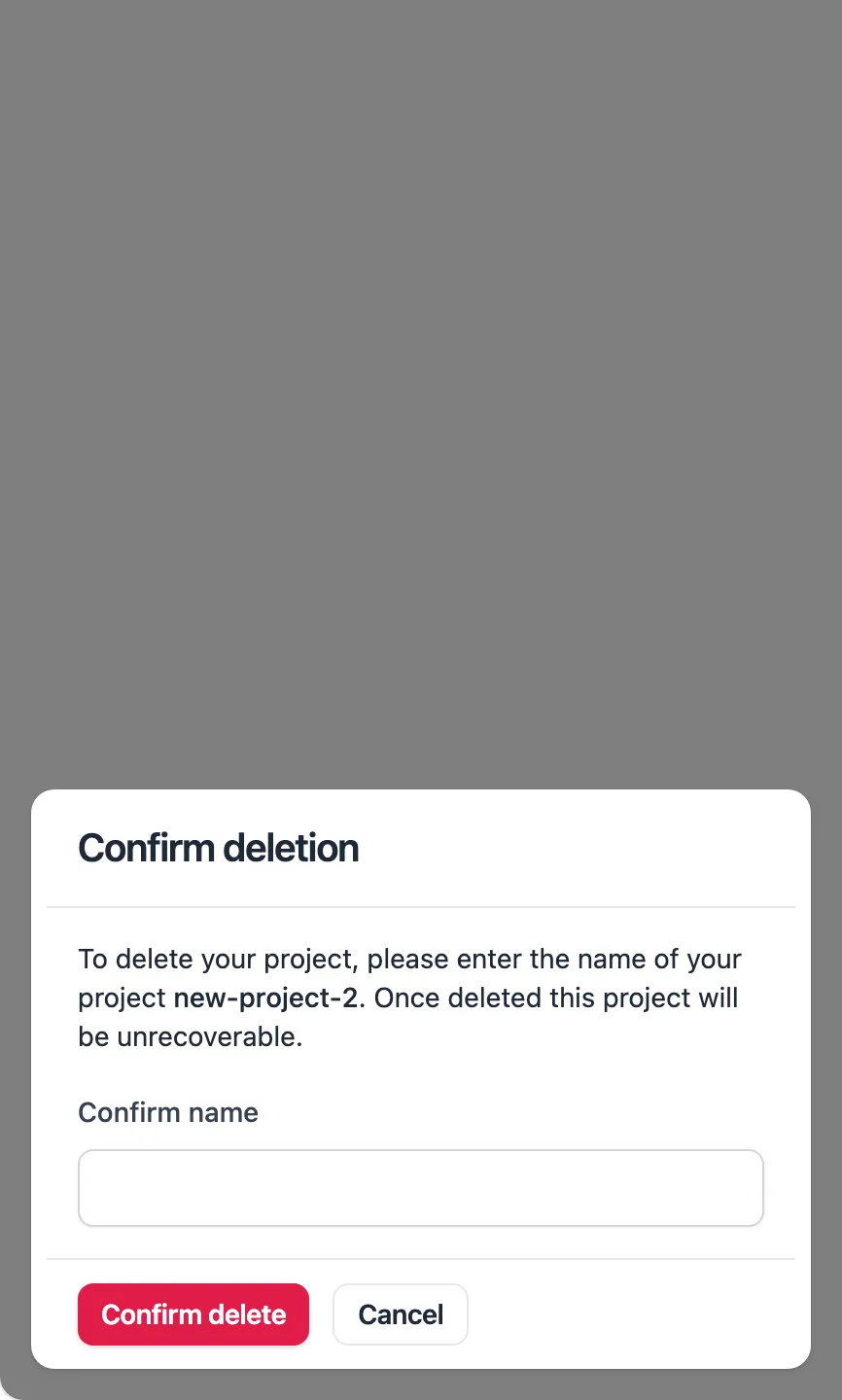
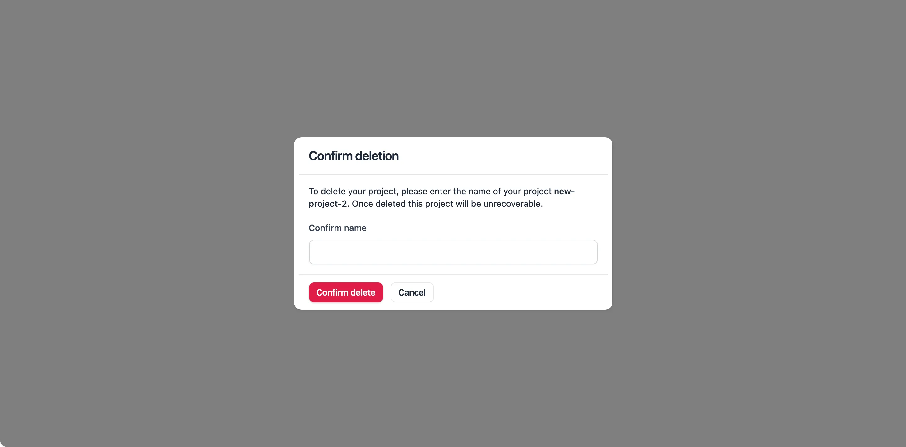
Confirm deletion
</x-app-ui::modal.heading>
</x-slot>
<x-app-ui::prose size="sm">
To delete your project, please enter the name of your project <strong>new-project-2</strong>. Once deleted this project will be unrecoverable.
</x-app-ui::prose>
<x-app-ui::input label="Confirm name" name="name_confirmation" />
<x-slot name="footer">
<x-app-ui::modal.actions>
<x-app-ui::button color="danger" size="sm">
Confirm Delete
</x-app-ui::button>
<x-app-ui::button x-on:click="open = false" color="secondary" size="sm">
Cancel
</x-app-ui::button>
</x-app-ui::modal.actions>
</x-slot>
</x-app-ui::modal>
<x-app-ui::modal id="purchase-success">
<x-slot name="trigger">
<x-app-ui::button x-on:click="open = true">
Open success pop-up
</x-app-ui::button>
</x-slot>
<x-slot name="heading">
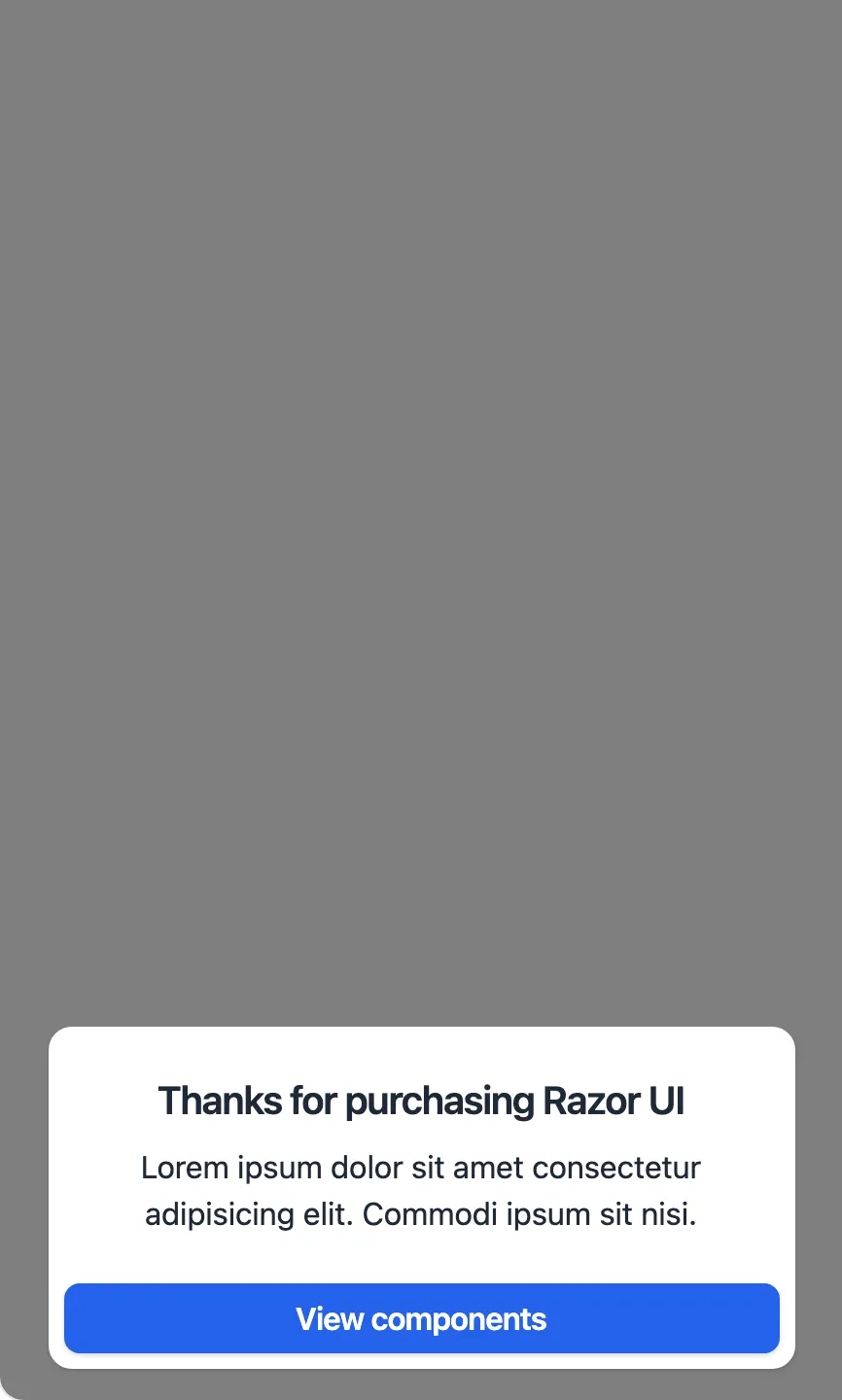
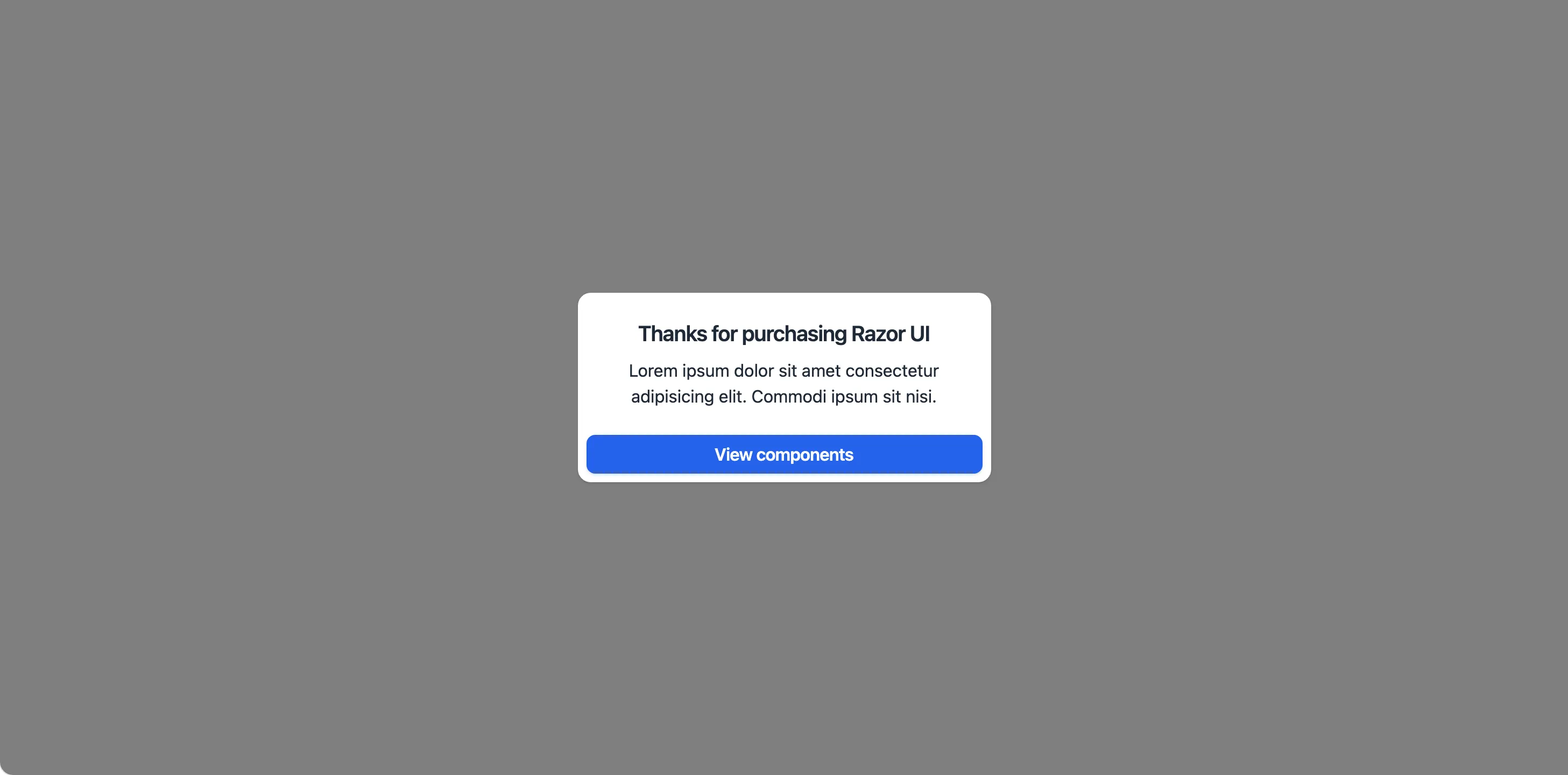
Thanks for purchasing Razor UI
</x-slot>
<x-slot name="subheading">
Lorem ipsum dolor sit amet consectetur adipisicing elit. Commodi ipsum sit nisi.
</x-slot>
<x-slot name="actions">
<x-app-ui::modal.actions full-width>
<x-app-ui::button>
View components
</x-app-ui::button>
</x-app-ui::modal.actions>
</x-slot>
</x-app-ui::modal>
<x-app-ui::modal width="2xl" id="terms">
<x-slot name="trigger">
<x-app-ui::button x-on:click="open = true">
Open with header, content and footer
</x-app-ui::button>
</x-slot>
<x-slot name="header">
<x-app-ui::modal.heading>
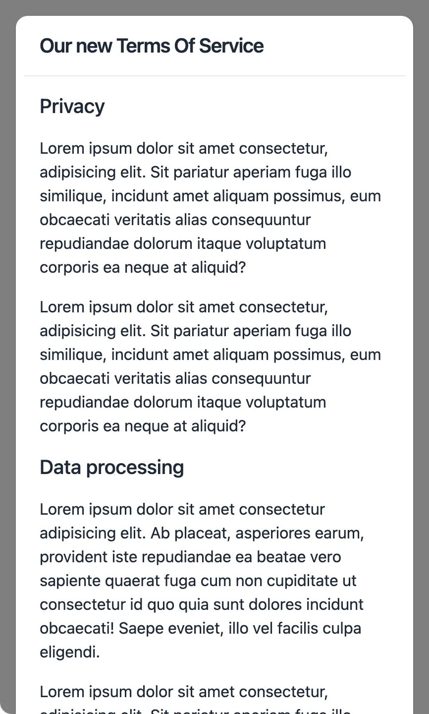
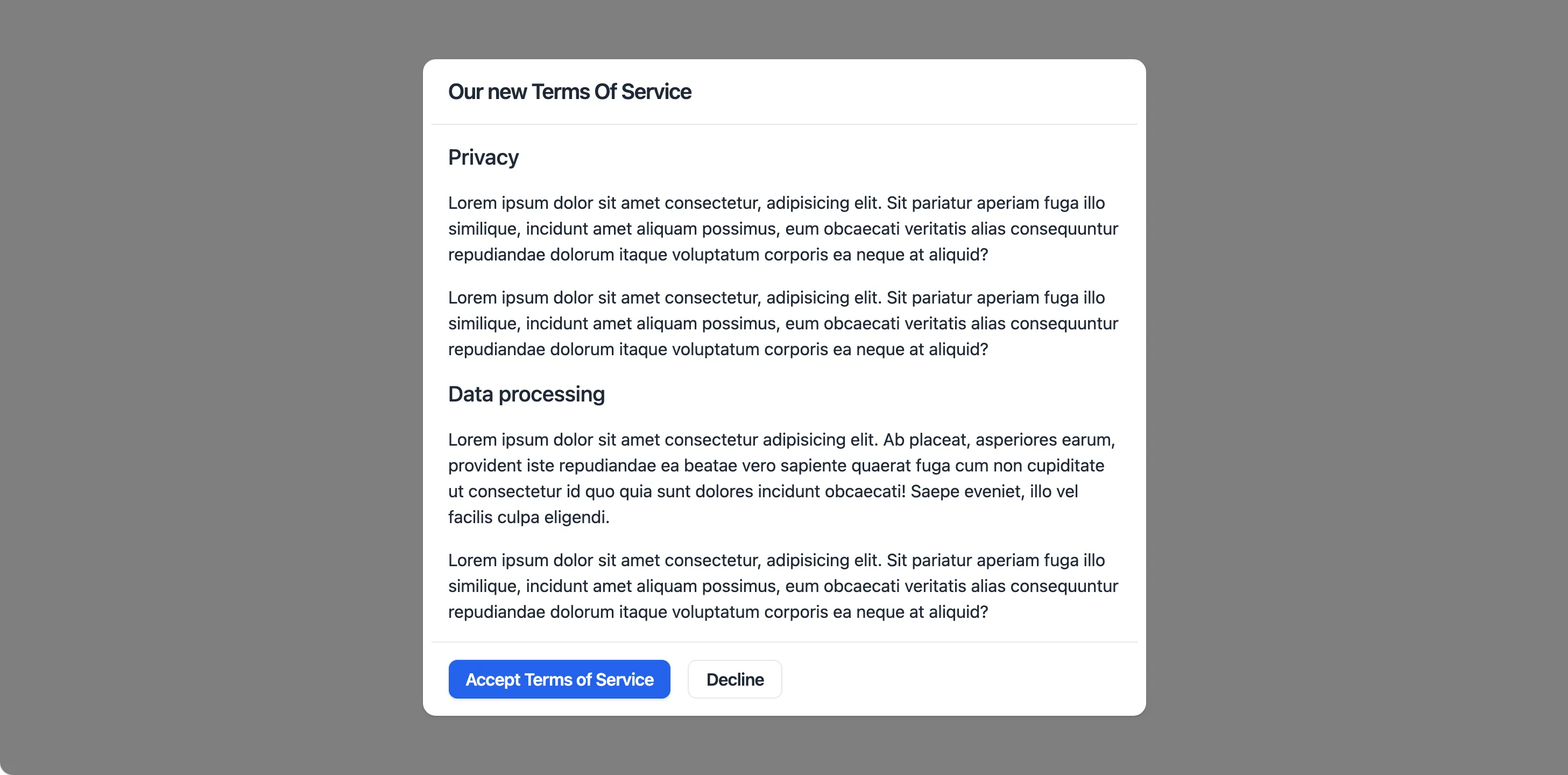
Our new Terms Of Service
</x-app-ui::modal.heading>
</x-slot>
<x-app-ui::prose>
<h3>Privacy</h3>
<p>
Lorem ipsum dolor sit amet consectetur, adipisicing elit. Sit pariatur aperiam fuga illo
similique, incidunt amet aliquam possimus, eum obcaecati veritatis alias consequuntur
repudiandae dolorum itaque voluptatum corporis ea neque at aliquid?
</p>
<p>
Lorem ipsum dolor sit amet consectetur, adipisicing elit. Sit pariatur aperiam fuga illo
similique, incidunt amet aliquam possimus, eum obcaecati veritatis alias consequuntur
repudiandae dolorum itaque voluptatum corporis ea neque at aliquid?
</p>
<h3>Data processing</h3>
<p>
Lorem ipsum dolor sit amet consectetur adipisicing elit. Ab placeat, asperiores earum, provident
iste repudiandae ea beatae vero sapiente quaerat fuga cum non cupiditate ut consectetur id quo
quia sunt dolores incidunt obcaecati! Saepe eveniet, illo vel facilis culpa eligendi.
</p>
<p>
Lorem ipsum dolor sit amet consectetur, adipisicing elit. Sit pariatur aperiam fuga illo
similique, incidunt amet aliquam possimus, eum obcaecati veritatis alias consequuntur
repudiandae dolorum itaque voluptatum corporis ea neque at aliquid?
</p>
</x-app-ui::prose>
<x-slot name="footer">
<x-app-ui::modal.actions>
<x-app-ui::button>
Accept terms of service
</x-app-ui::button>
<x-app-ui::button x-on:click="open = false" color="secondary">
Decline
</x-app-ui::button>
</x-app-ui::modal.actions>
</x-slot>
</x-app-ui::modal>
API
app-ui::modal
Attributes
| Name | Default | Options | Notes |
|---|---|---|---|
aria-labelledby |
heading container, if present |
Used for accessibility features. | |
close-event-name |
close-modal |
Used as the name of the browser event to close the modal. | |
display-classes |
inline-block |
Used to alter the display mode of the trigger. | |
id |
Used for triggering modal state using browser events, and accessibility features. | ||
open-event-name |
open-modal |
Used as the name of the browser event to open the modal. | |
width |
sm |
xs, sm, md, lg, xl, 2xl, 3xl, 4xl, 5xl, 6xl, 7xl, full |
Browser events
| Name | Parameters | Description | Notes |
|---|---|---|---|
close-modal |
id of modal |
Close the modal. | Event name can be customised using the close-event-name attribute. |
open-modal |
id of modal |
Open the modal. | Event name can be customised using the open-event-name attribute. |
Slots
| Name | Notes |
|---|---|
| Main | Contains the content of the modal, between its header and footer. |
actions |
Contains an app-ui.modal.actions component to display below the content of the card, before its footer. |
footer |
Contains content for the footer section of the modal. |
header |
Contains content for the header section of the modal. |
heading |
Contains heading text. |
subheading |
Contains subheading text. |
trigger |
Contains the element to trigger the modal open. This element should use the attribute x-on:click="open = true" |
app-ui::modal.actions
Attributes
| Name | Default | Options | Notes |
|---|---|---|---|
align |
left |
left, center, right |
|
full-width |
false |
Boolean expression | This stretches the child buttons to occupy the full container width. |
Slots
| Name | Notes |
|---|---|
| Main | Contains the individual app-ui::button components. |
app-ui::modal.heading
Slots
| Name | Notes |
|---|---|
| Main | Contains the text content of the heading. |
app-ui::modal.subheading
| Name | Notes |
|---|---|
| Main | Contains the text content of the subheading. |